What we saw
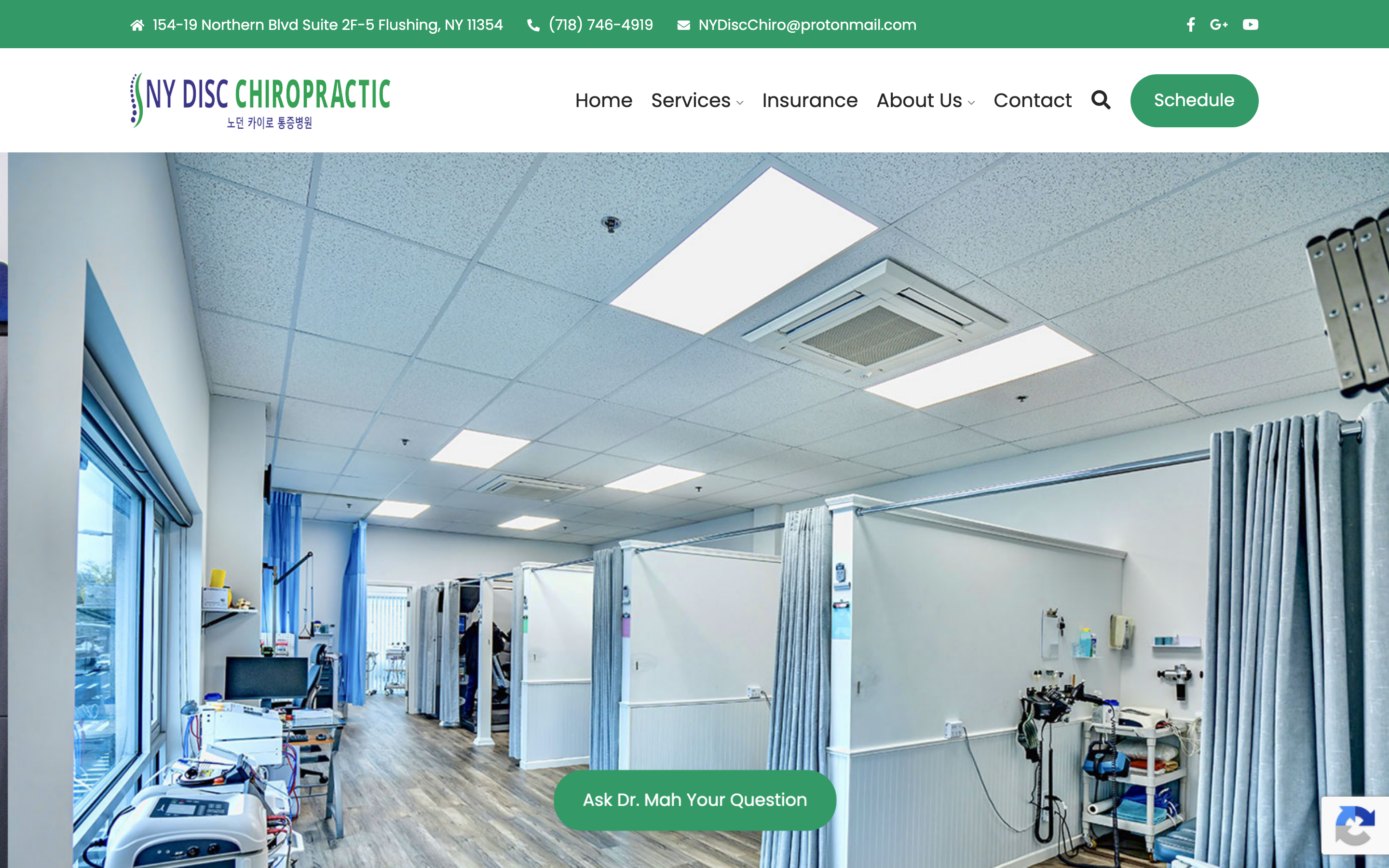
Above: how your site appears to a new visitor on desktop.
I found four specific reasons. Here's what's happening and what to do about it.
Above: how your site appears to a new visitor on desktop.
Back pain and disc problems often hit people hardest late at night, or flare up on a weekend. That's when they go online looking for help. Right now, your site gives them only one option: call your office. If it's after hours, there's no button to book, no form to fill out, no way to say "I need to come in." Most people won't call back in the morning, they find someone else who makes it easier. A simple way to request an appointment online would catch all of those people.
Most people searching for a chiropractor near them are on their phones. Your site loads slowly on mobile and is built for a desktop screen, text is small, buttons are hard to tap, and there's no easy way to call you with one touch. Someone searching "chiropractor Flushing" on their phone has about ten seconds before they go back to Google and try someone else.
You've treated more than ten thousand patients over two decades. That's an extraordinary number, most chiropractors in Flushing have a fraction of that experience. But a new visitor landing on your homepage has no idea. The years and the patient count aren't featured anywhere obvious. For someone choosing between you and a newer clinic, that history is exactly what would make them call you.
You see patients in Korean and English, that's a real advantage in Flushing. But nothing on your website tells a Korean-speaking patient that they'll be comfortable here. Adding even a small note in both languages would immediately tell that part of the community that this is the right place for them.
Even a simple form, name, phone number, "briefly describe what's going on", lets someone reach out at any hour. You call them back the next morning. The people most likely to fill it out are the ones hurting at midnight with nowhere else to turn.
This is your strongest credential and it should be the first thing a new visitor sees, not something they have to scroll for. New patients choose chiropractors based on trust and experience. Show them both up front.
A bar at the bottom of every page, visible no matter where someone is on the site. On a phone, one tap dials. People in pain don't want to hunt for your phone number.
A single line near the top, "We see patients in Korean and English" (한국어로 진료합니다), immediately signals to a large part of the Flushing community that this practice was built for them.
After 20 years you have patients who are loyal to you. A few of their Google reviews on your homepage, even three or four, give a first-time visitor the social proof they need to make the call.
It felt easier to show you than to describe it. Your twenty years and ten thousand patients up front, a way to book, put together the way a practice like yours deserves. It is just a concept, and it is yours to look at.
See your redesign →This page is the short version. If any of it is useful, I am happy to hop on a quick call and show you exactly how each fix would look on your site. No cost, no pressure, just finishing what I started.
Replies come straight to Cody Wong · usually same day