What we saw
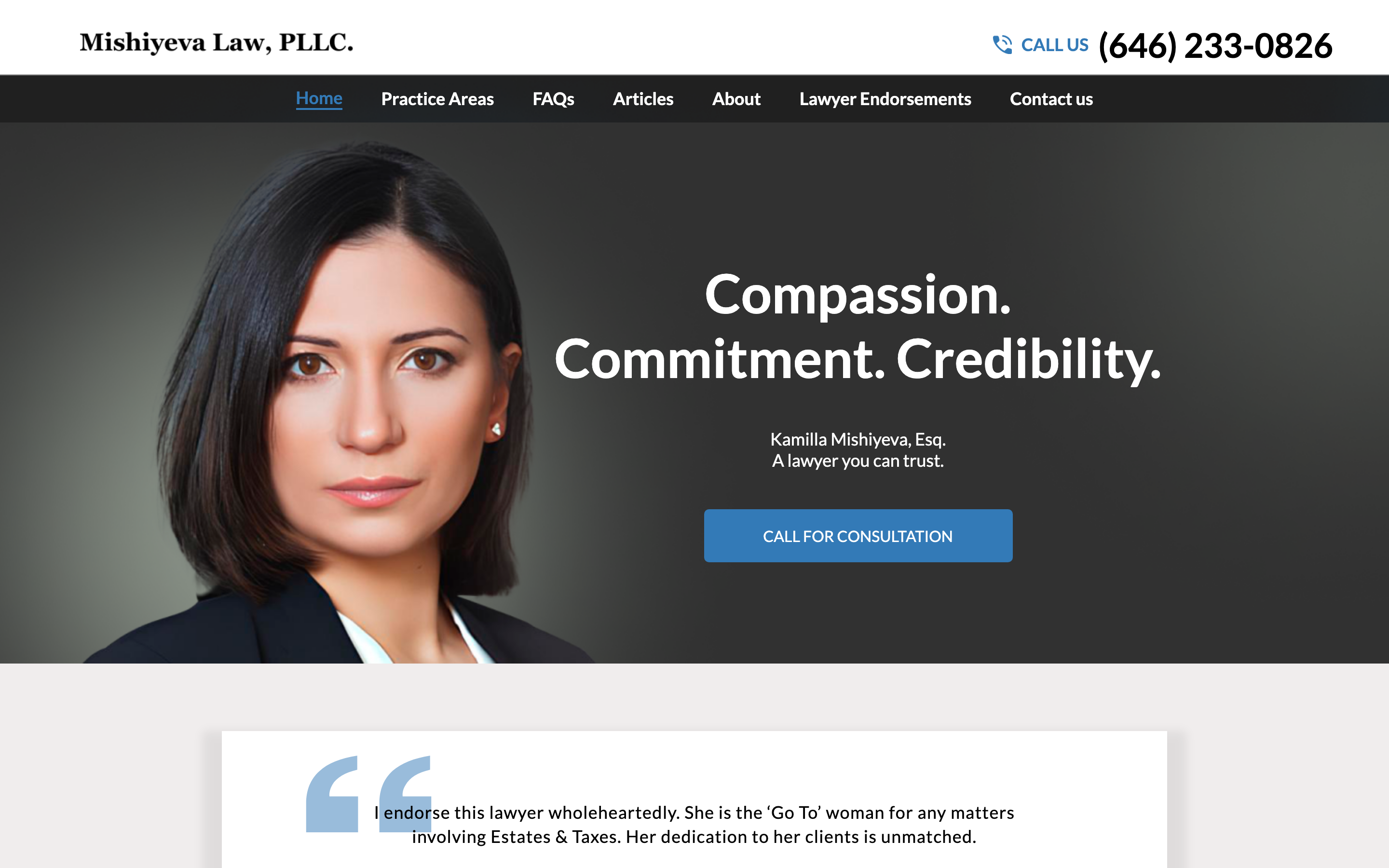
Above: how your site appears to a new visitor on desktop.
I found four specific reasons. Here's what's happening and what to do about it.
Above: how your site appears to a new visitor on desktop.
The thing that makes Mishiyeva Law different from every other estate attorney in New York is the international work, helping families navigate estates that cross borders, involve foreign assets, or require dealing with courts in other countries. That's a niche most attorneys won't touch. But on your homepage, it sits below generic copy about wills and probate that could describe any law office. The family who just found out their parent passed away in another country has to scroll to find the one reason they'd call you instead of anyone else.
Estate and probate cases come to attorneys at difficult times, when someone is grieving, overwhelmed, or just trying to understand what happens next. Most people in that moment are not ready to make a phone call. They want to reach out quietly, in writing, when they're ready. Right now, your site gives them only one option: call. A simple contact form that says "tell us your situation and we'll call you back" would catch the people who are most in need of your help but least likely to dial.
Most people have never hired an estate attorney before. They don't know if they'll be charged for an initial call, how long it takes, or what you'll need from them. That uncertainty keeps a lot of people from reaching out even when they need to. A short paragraph explaining what the first step looks like removes the fear of the unknown and makes it much easier for someone to take action.
A lot of people researching estate attorneys do it on their phone, often while commuting or waiting somewhere. Your site was designed for a desktop screen, and on mobile some things are small and hard to read. A phone number that you have to manually copy and dial loses people who are already halfway to calling you.
Move the cross-border and foreign-decedent language to the first thing a visitor reads. Something like: "We handle estates that cross borders, foreign assets, international heirs, courts in other countries." The person who needs exactly that will know immediately they're in the right place.
A simple form, name, phone number, brief description of the situation, lets people reach out without having to make a call they're not ready for. It works at midnight when someone is finally sitting down to deal with something hard.
Three short bullets: you send us a message, we call you back within one business day, we talk through your situation with no obligation. Knowing what to expect removes the hesitation that stops most people from reaching out.
A bar at the bottom of every page with your phone number, visible no matter where someone is scrolling. On a phone, one tap dials. No copying, no searching the page.
Estate clients are often in a vulnerable and stressful moment. A few Google reviews from families you've helped, even three or four, make a first-time visitor feel like they're in safe hands. It's the fastest way to build trust with someone who doesn't know you yet.
It felt easier to show you than to describe it. Your international work leading, a clear way for families to reach you, put together the way a firm like yours deserves. It is just a concept, and it is yours to look at.
See your redesign →This page is the short version. If any of it is useful, I am happy to hop on a quick call and show you exactly how each fix would look on your site. No cost, no pressure, just finishing what I started.
Replies come straight to Cody Wong · usually same day