What we saw
Above: how your site appears to a new visitor on desktop.
I found four specific reasons. Here's what's happening and what to do about it.
Above: how your site appears to a new visitor on desktop.
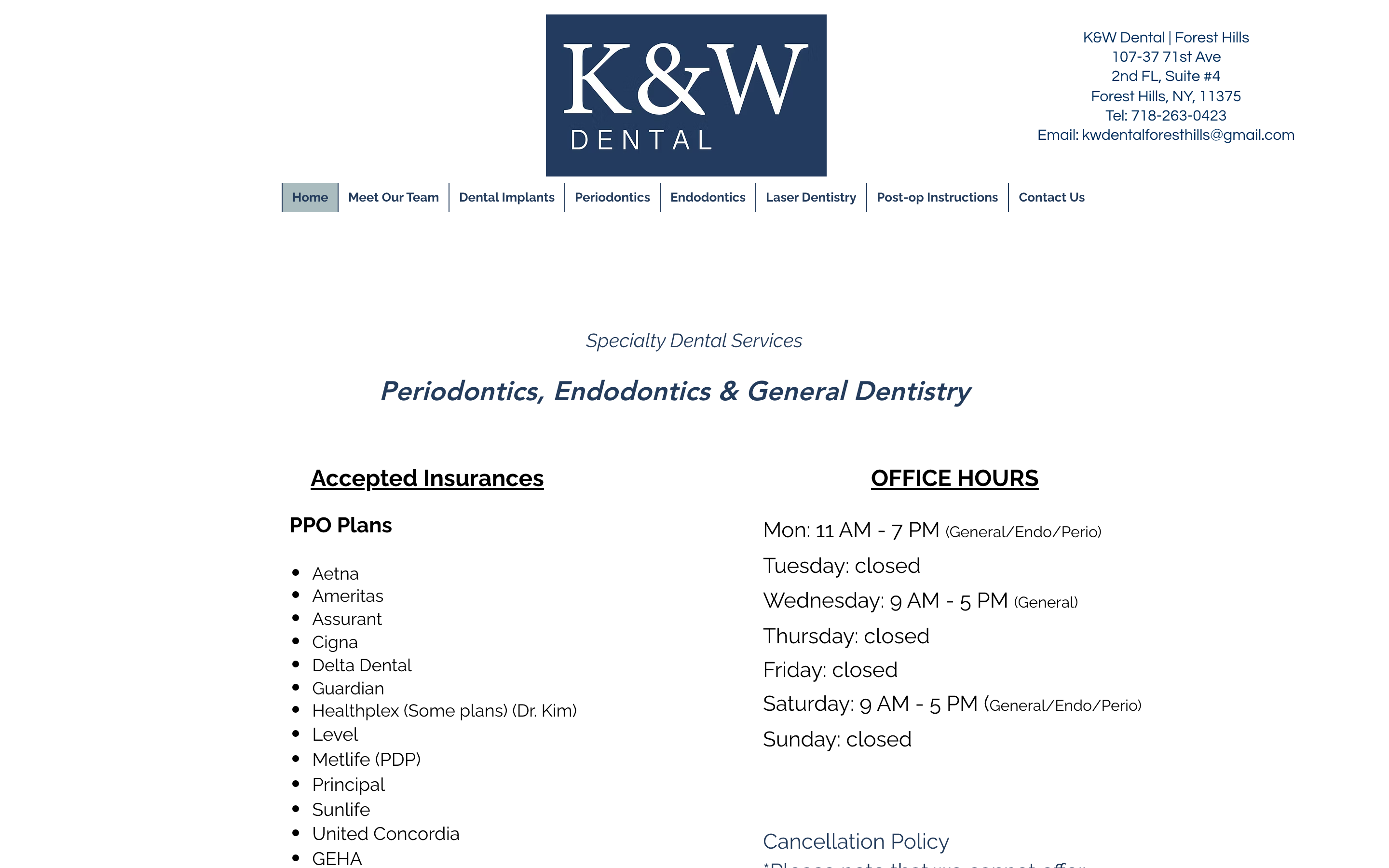
Your contact page has a phone number and a Gmail address, but no click-to-call link, no booking form, and no online scheduler. Someone on their phone has to copy the number manually to dial it. The first thing a new visitor sees on your homepage is a 48-hour cancellation warning, which signals policy before it signals welcome. A simple contact form and a tap-to-call link would remove the friction that's sending people to the next dentist on Google.
Two Stony Brook classmates who came back to take over a fifty-year-old Forest Hills practice. Dr. Wang trained in both gum disease and root canals, a dual specialization that almost no dentist in Queens can offer. These are the things that make a nervous new patient choose you over the next name on Google. But they're not visible at the top of your site. A new visitor who only reads the first screen has no idea what makes this practice worth trusting.
Most people searching for a dentist in Forest Hills are doing it on their phone. Your site is built for a desktop screen, so on mobile some elements are small and hard to tap. The gap between "I found this practice" and "I booked an appointment" should be as small as possible.
Dental patients are often anxious. Before they walk in somewhere new, they want to know what other patients say. There are no reviews, star ratings, or patient quotes on your homepage. Adding even a few Google reviews where they're easy to see would give hesitant first-time visitors the reassurance they need to book.
Make your phone number a live tap-to-call link so mobile visitors can dial with one touch. Add a simple contact form, name, phone, "briefly describe what you need", so anyone can reach out at any hour without having to call. This is the highest-impact fix on the list.
One dentist trained in both periodontics (gum treatment) and endodontics (root canals) is genuinely unusual. Lead with it near the top of the page. It immediately separates you from every general dentist in the neighborhood.
Fifty years serving Forest Hills. Two Stony Brook classmates who came back to keep it going. That's not a generic dental office, that's a neighborhood institution. That story should be on the homepage, not buried or absent.
A bar at the bottom of the screen visible on every page, "Call K&W Dental" with your number, lets anyone reach you with one tap. The easier you make it to call, the more people actually call.
A practice that's been in the neighborhood for fifty years has patients who love it. Pull your best Google reviews and put them near the top of the page. Let new visitors see that before they decide whether to book.
It felt easier to show you than to describe it. Fifty years of trust, your dual training, a way to book, all put together the way a practice like yours deserves. It is just a concept, and it is yours to look at.
See your redesign →This page is the short version. If any of it is useful, I am happy to hop on a quick call and show you exactly how each fix would look on your site. No cost, no pressure, just finishing what I started.
Replies come straight to Cody Wong · usually same day