What we saw
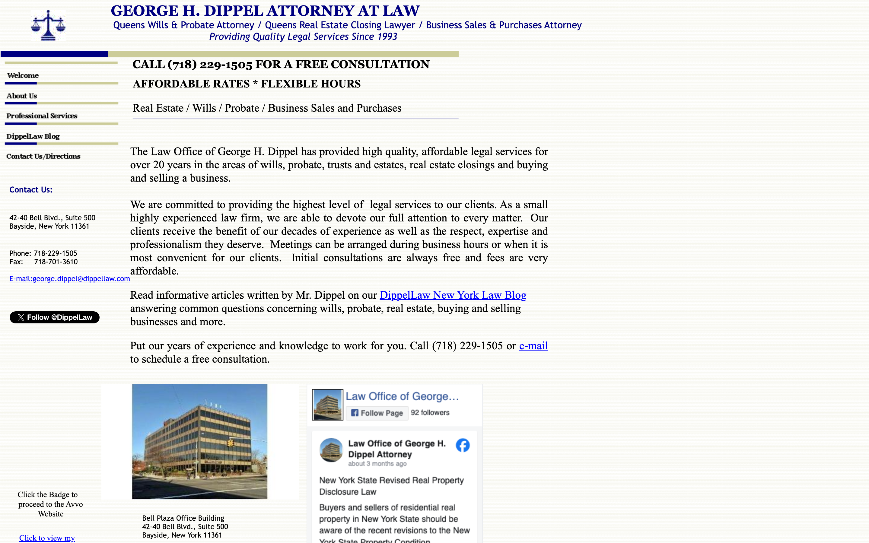
Above: how your site appears to a new visitor on desktop.
I found four specific reasons. Here's what's happening and what to do about it.
Above: how your site appears to a new visitor on desktop.
Most people researching wills, estates, and probate do it late at night, after the kids are in bed, after work, when things feel heavy. Right now, your site only gives them two options: call your office (closed) or send a cold email into the dark. Most people won't do either. They'll close the tab and find someone else who makes it easier to take that first step. A simple contact form that says "send us your situation, we'll call you back" would catch every one of those people.
Over half the people who find you through Google are on their phones. Your site was built for a desktop screen, on a phone, text is small, buttons are hard to tap, and there's no way to call you with one tap. A sticky "Call Now" button at the bottom of every page would let anyone reach you instantly, no matter where they are on the site.
Cornell Law. A partner at Rivkin Radler. Teaching real estate law at LIU. Appearing on radio to explain wills and probate in plain English. These are the things that make a nervous client choose you over someone else, but they're hidden deep in the page. A new visitor who only scrolls halfway never sees them.
After 30+ years in Bayside, you've helped a lot of families through some of the hardest moments of their lives. But someone visiting your site for the first time has no way to know that. There are no reviews, no star ratings, no client stories. Adding even 3, 5 Google reviews to your homepage would immediately make a nervous first-time visitor feel like they're in safe hands.
A simple form, name, phone, "briefly describe your situation", lets anyone reach out without having to call. It works while you sleep. People fill these out at 11pm all the time. This is the single highest-impact change you can make.
Three simple bullets: "You fill out the form. We call you back within 24 hours. We figure out together if we're the right fit, no pressure." This removes the fear of the unknown that stops most people from reaching out.
Cornell Law, Rivkin Radler, LIU adjunct, radio appearances, these should be the first things a visitor sees, not something they have to scroll to find. Trust is built in the first 5 seconds.
A bar at the bottom of the screen that says "Call George: (718) 229-1505", visible no matter where someone is on your site. On a phone, one tap dials. No copying, no searching.
The Twitter/X badge on your site is outdated and adds no trust. A Google Reviews star rating in its place, even 4 or 5 reviews, is something every visitor instantly understands and trusts.
It felt easier to show you than to describe it. Your community roots, the families you help, a clear way to reach you, put together the way a practice like yours deserves. It is just a concept, and it is yours to look at.
See your redesign →This page is the short version. If any of it is useful, I am happy to hop on a quick call and show you exactly how each fix would look on your site. No cost, no pressure, just finishing what I started.
Replies come straight to Cody Wong · usually same day